

—
British Camp 1
LŌgŌ design
/ / / / / / / / / / / / / / / / / / / / / / / / / /
—
Logo design and subsequent T-shirts printing
for British School summer camp in Latvia, 2017.
+
Company: British School StudyLab
—
The brief for this project requested a new logo for the British Summer Camp in Latvia and subsequently it needed to be printed on all T-shirts for the school kids and teachers bound for a journey there. T-shirt colors had been preselected already — light blue for kids and black for teachers.
The previous logo for the camp incorporated the words “British Camp” and this time British School wanted to have a graphic element that conveys a message of camping and adventure along with the inscription “British Camp” set in their corporate font.
J U N E 2 0 1 7 — J U L Y 2 0 1 7 / B R I T I S H C A M P / L Ø G Ø D E S I G N
—
Initially as a rule of thumb I opted for thumbnail sketches. It allows a rather quick exploration of ideas. In the beginning I had a vague idea of what overall setting might look like so sketching out different elements that relate to the key words was necessary.
Bearing in mind that the kids had to be involved in diversified kinds of sport and activities in the camp — the first finished set of logos consisted of a circular elements encompassing trees (nature), arrow (traditional and medieval archery is indeed something to look forward to), tent (summer camping), name of the camp and its moto “Let’s get it on” which was later put in the back of T-shirts. However, as the process went on this idea was ditched in favor of a more simplified “tent” graphical element.
At this point I knew what I wanted the logo to look like, the kind of elements I wanted to use and the atmosphere I wanted to convey through it.
So ultimately, I opted for this composition — the words “British camp” incorporated into the triangular shape of the camping tent and in the background angular shape underneath the word “British” with slanted sides that sets the dynamic vibe of the camp. The final piece was finally approved and mockups were prepped for printing.


—
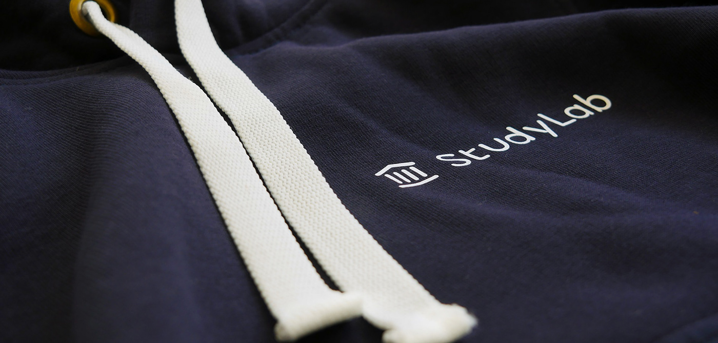
British Camp 2
LŌgŌ design
/ / / / / / / / / / / / / / / / / / / / / / / / / /
—
Logo design and subsequent hoodie printing
for British School summer camp on the Isle of Wight, England, 2018.
+
Company: British School StudyLab
—
The brief for this project requested a new logo for the British Summer Camp in England and subsequently it needed to be printed on all hoodies for the school kids and teachers bound for a journey there.
Located just off of the south coast of England, the Isle of Wight is only 2 hours door-to-door from London via ferry or hovercraft, making it the perfect year-round destination to explore with family and friends.
J U N E 2 0 1 8 — J U L Y 2 0 1 8 / B R I T I S H C A M P / L Ø G Ø D E S I G N


—
THANK YŌU!
—


